Redesigning Stock Screener Tool
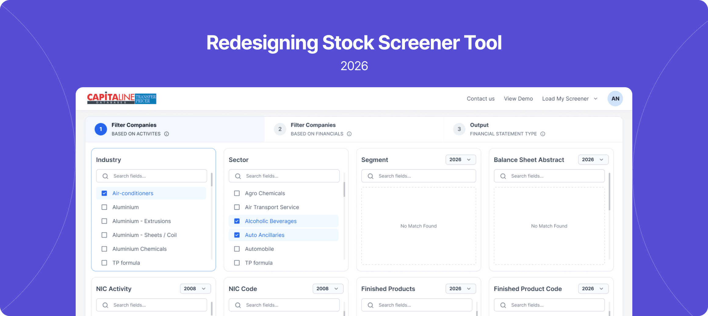
TP Screener is a research tool that lets analysts filter thousands of companies by industry, sector, activity and financial parameters, then build custom financial reports off the matched set.
Timeline
6 Months
Role
UI/UX Designer
Type
Redesign
Overview
TP Screener is a research tool that lets analysts filter thousands of companies by industry, sector, activity and financial parameters, then build custom financial reports off the matched set.
I was responsible for redesigning the entire screening flow — from how filters are applied, to how financial criteria are built, to how the final report is generated — along with the navigation structure and the UI components that power it.
The Problem
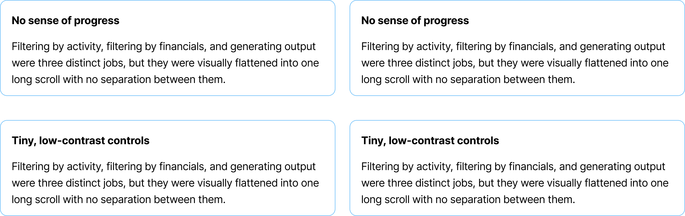
The original tool worked, but the experience worked against the user. Everything — activity filters, financial criteria, module and column selection, and the output settings — lived on a single, densely packed page. There was:
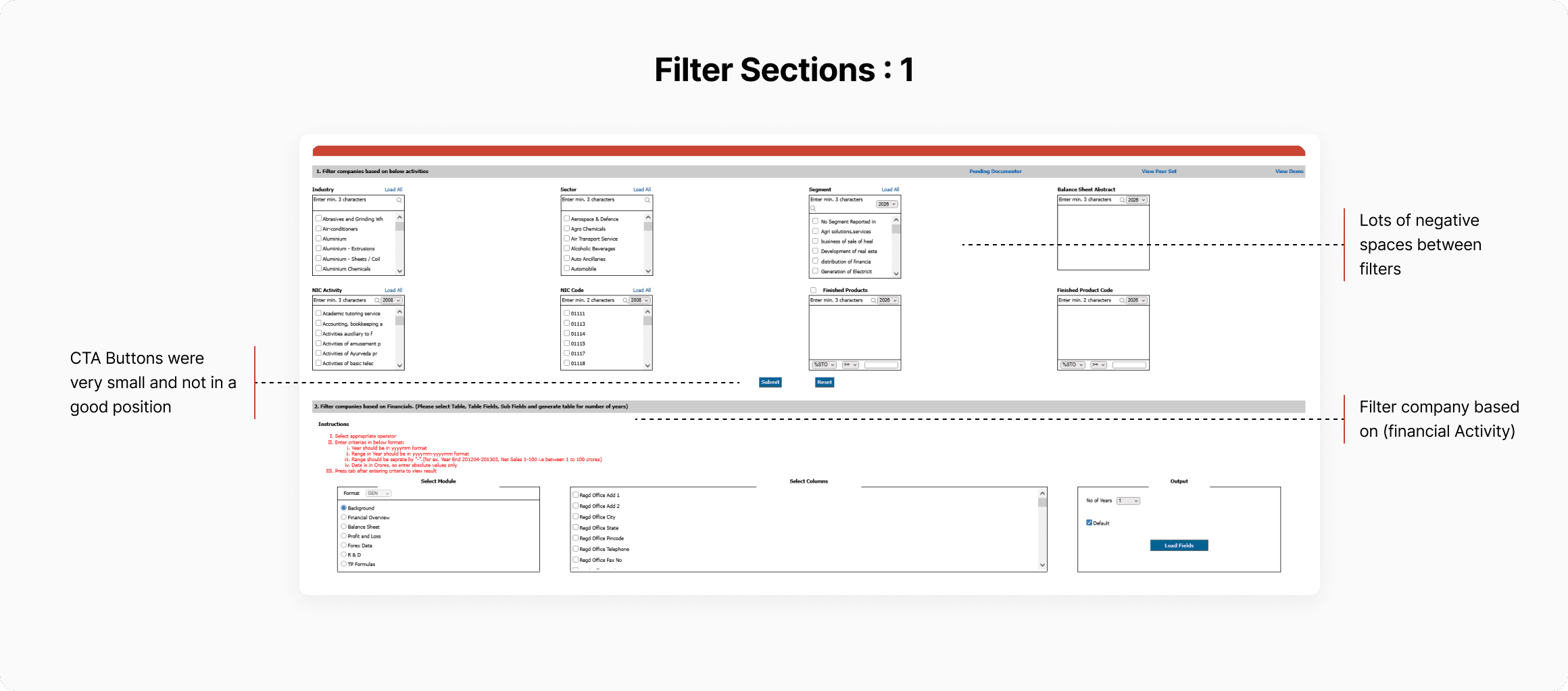
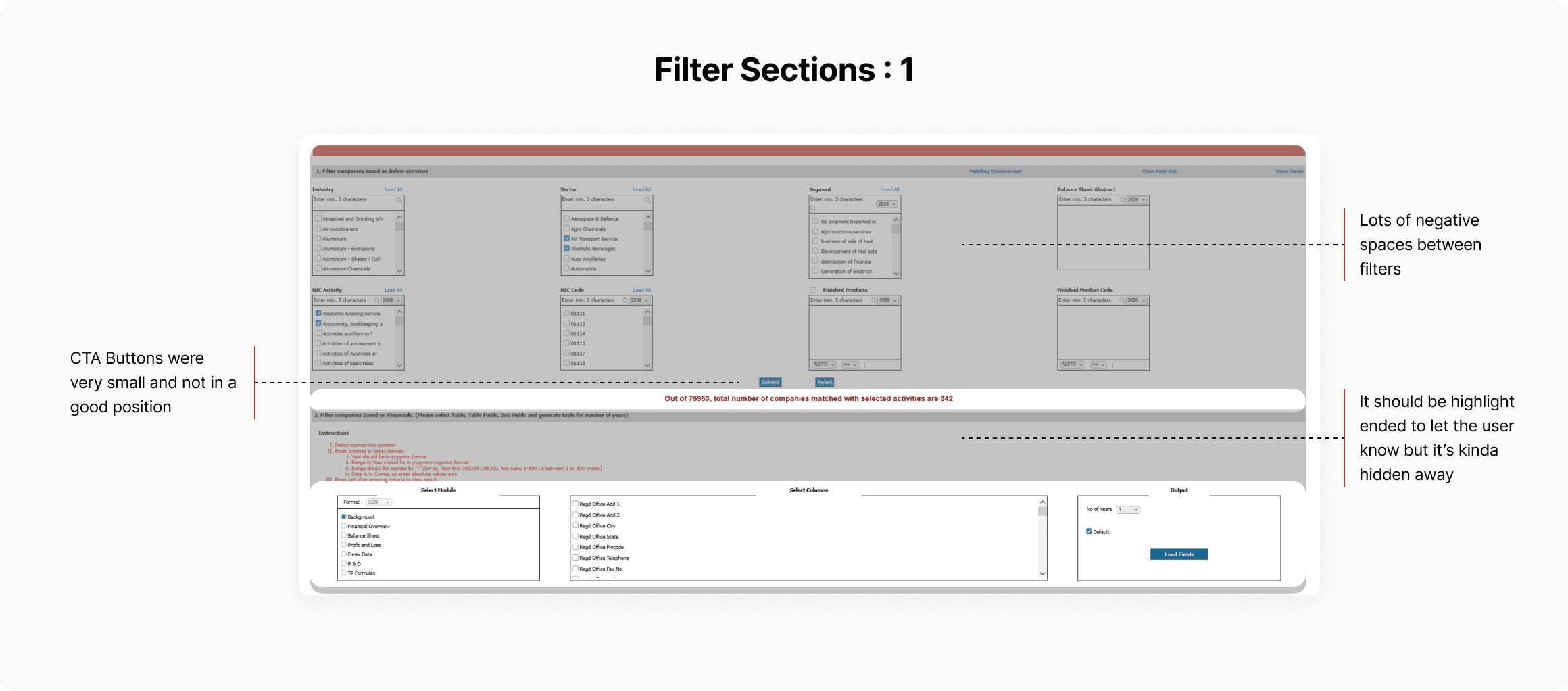
For a tool used daily by analysts to build transfer-pricing reports, this friction added up — more time spent figuring out the interface, more room for input errors, and no clear feedback on how filters were narrowing the company set.
The Goal
Redesign TP Screener into a guided, step-based flow that makes it obvious where a user is, what they've selected, and what to do next — while keeping the tool's depth of filtering power fully intact.
The Designs
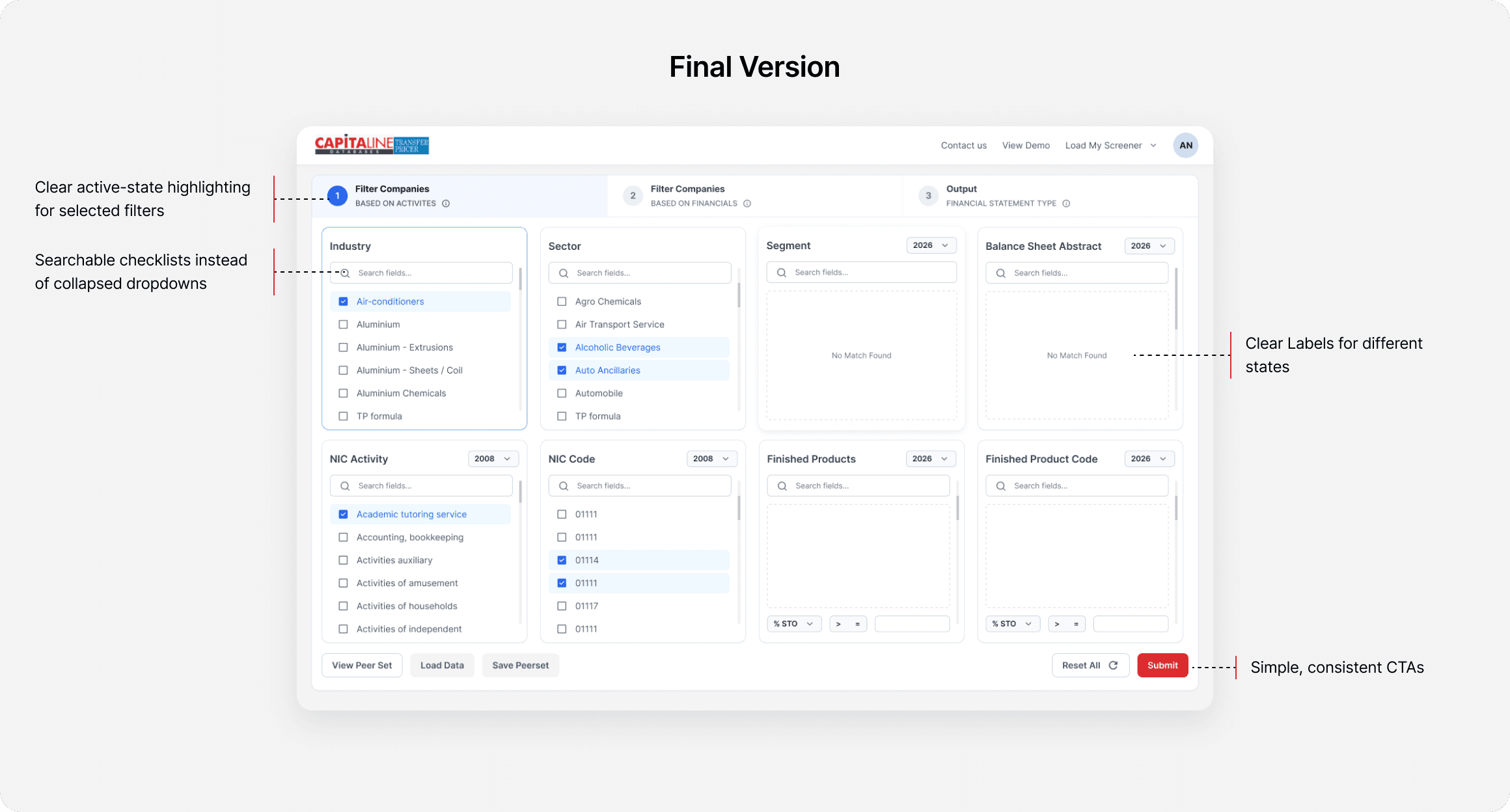
Filter companies based on activities
Problem
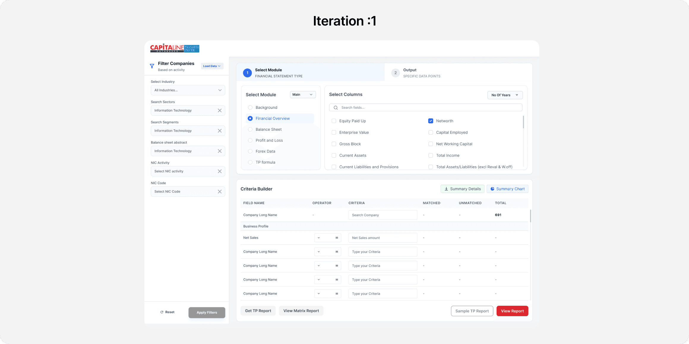
The original design (v1) used a persistent sidebar for filters, always visible alongside the main workflow. In usability testing, users found this confusing — they were used to a linear, step-by-step flow and didn't understand why filters and the main task were shown together.
Insight
Users think in sequential steps, not parallel panels. A sidebar felt efficient in theory, but broke the mental model people already had from prior tools.
Outcome
By matching the design to the user's existing mental model — one step at a time — the flow became easier to follow, reduced confusion, and made filtering feel guided rather than overwhelming.
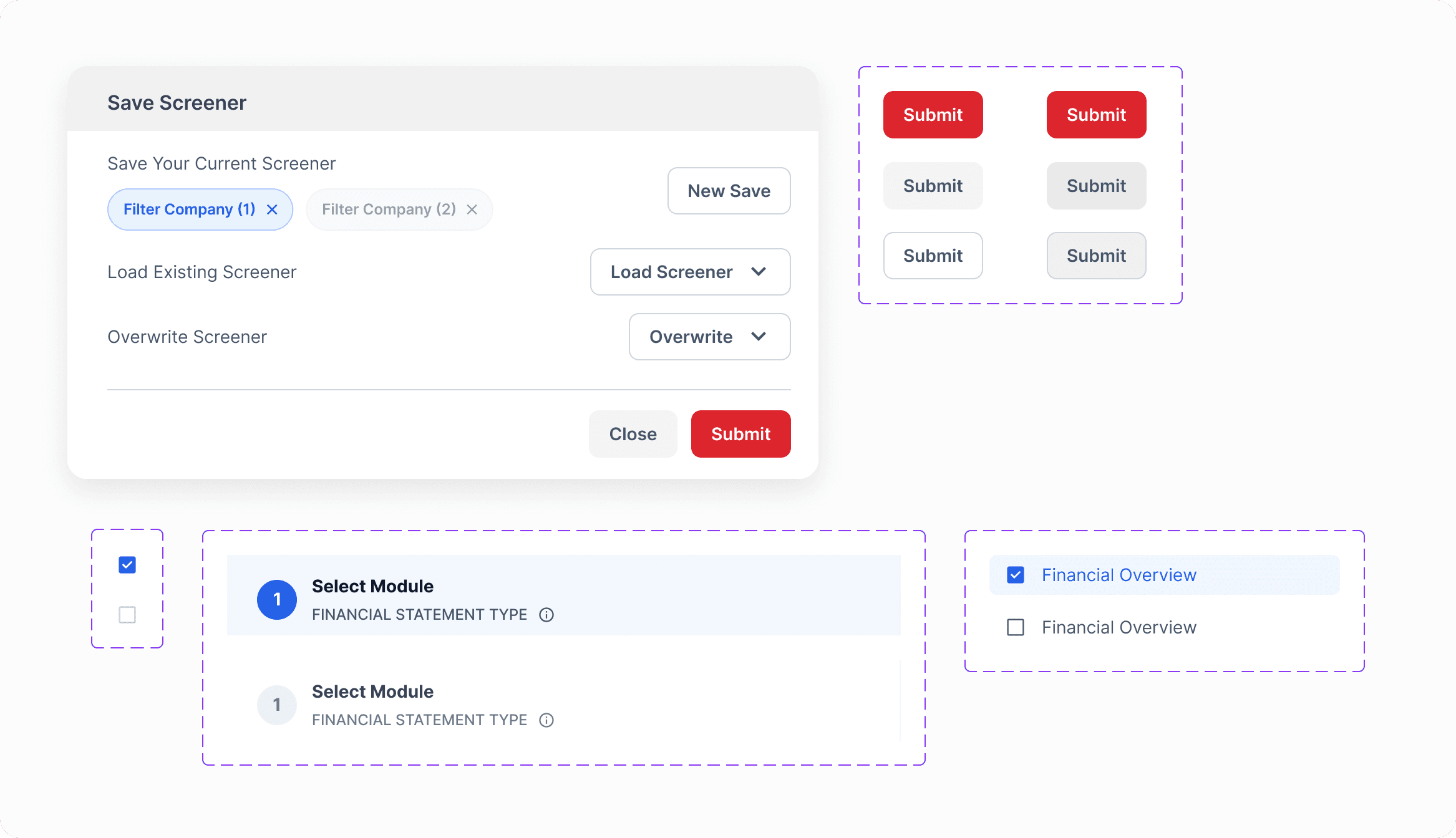
Filter & Button States
Filter companies based on financials
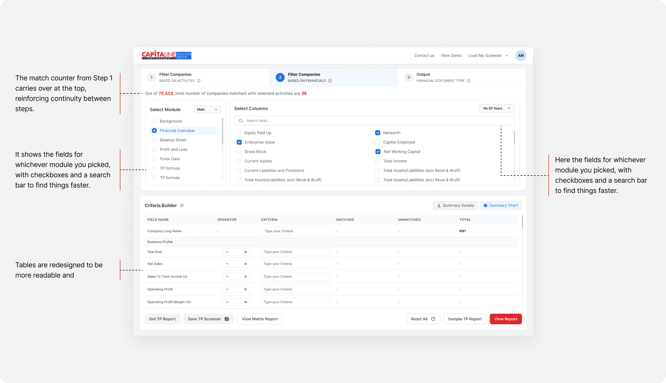
This step used to be three separate, disconnected sections — module selection, column selection, and criteria building. Now they all live together in one layout that actually makes sense.
On the left is Select Module, just a simple radio list of report types: Background, Financial Overview, Balance Sheet, Profit and Loss, Forex Data, TP formula.
The old version made people do the work upfront and hope it turned out right. The new version gives feedback right away, so mistakes get caught in the moment instead of after submitting. Less reading, less memorizing, less back-and-forth clicking , just a more direct approach to the result.
Output
The output step turns the matched company list into a clean, readable report table — Company Long Name, Year End, Business Profile, Net Sales, Operating Profit to Total Cost, and RPT to Sales — with a "View" action per row and a single, prominent Export button. This replaced a more cluttered output panel and gives users a scannable, presentation-ready result at the end of the flow.
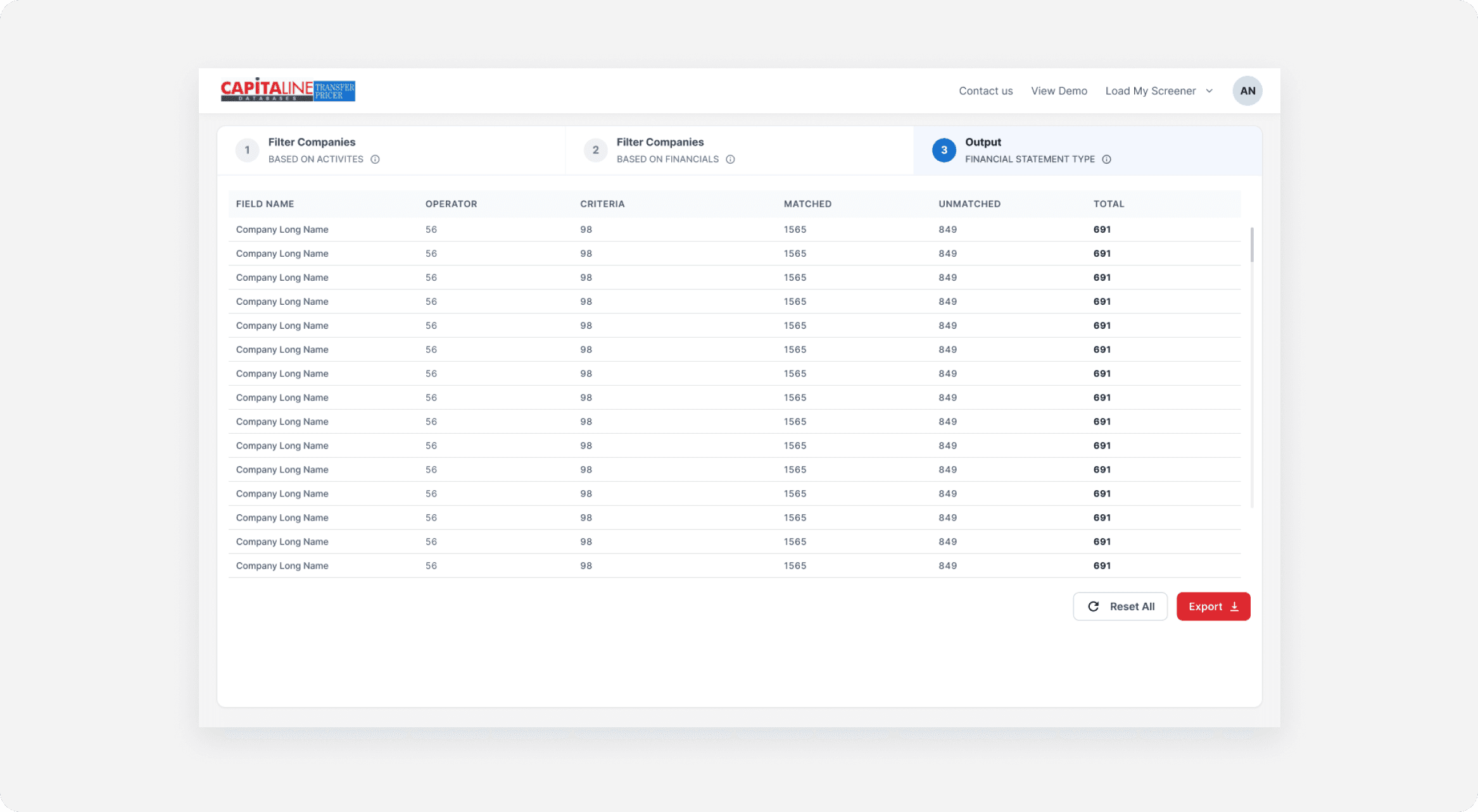
A second output view lets users review exactly which criteria produced the result set — Field Name, Operator, Criteria, Matched, Unmatched, and Total — in the same table pattern used in the Criteria Builder, so the summary feels like a natural extension of Step 2 rather than a new format to learn.
Impact
Redesigned flow reduced report generation time, cut criteria-formatting errors, and lowered filter-related support queries & increasing in usage of save preset usage and reuse past filters.

