Stock Market Mobile app Design
A stock market app to track prices, analyze trends, and explore company data,all in one easy place. User can also track F&O Market.
Timeline
6 Month
Role
UI/UX Designer
Type
Mobile application Design
About
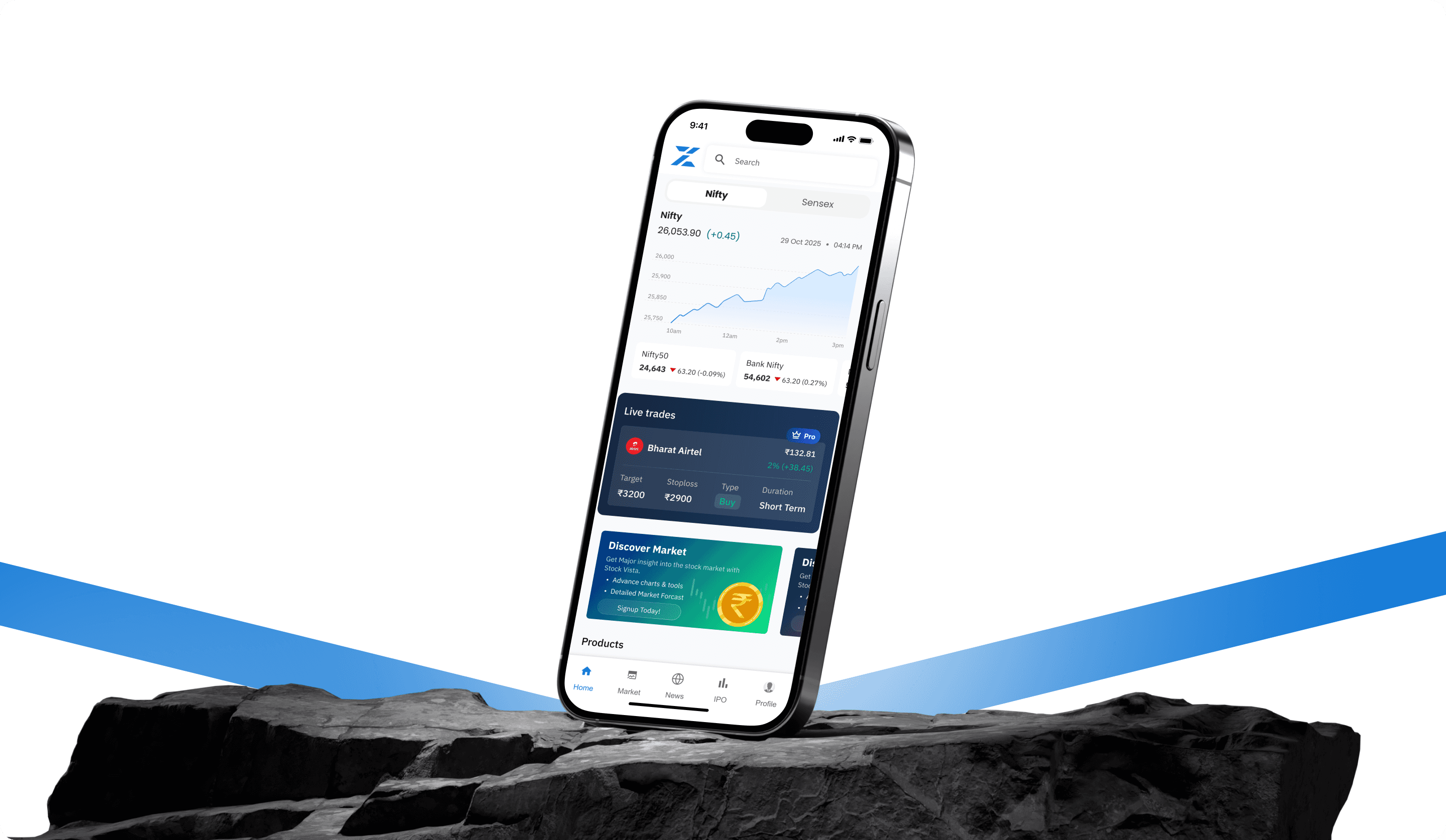
ZTrade is a mobile trading application designed to help retail investors monitor the stock market, analyze market movements, manage watchlists, and execute trades through an intuitive mobile experience.
Android App
iOS app
Goal
The goal of the product was to simplify stock trading for both beginners and experienced traders by combining real-time market data, technical analysis, portfolio tracking, and trading capabilities into a single platform. The app emphasizes live market monitoring, technical indicators, watchlists, alerts, and personalized dashboards.
My role
As the UX/UI Designer, I was responsible for the complete product design process from understanding the problem and exploring ideas to delivering the final interface ready for development. I worked closely with stakeholders and developers to ensure the design met both user needs and business goals.
Design Process
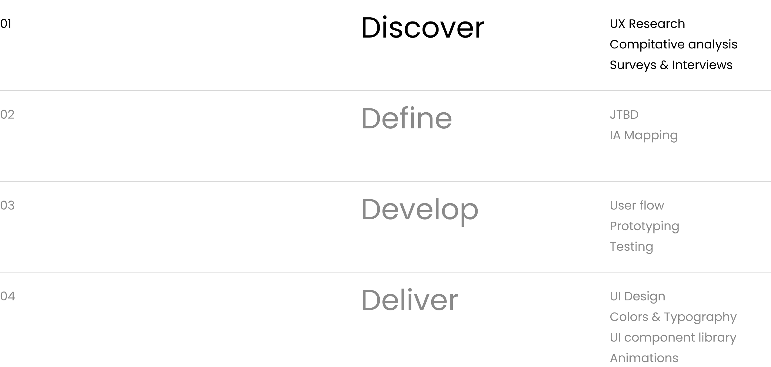
Understanding the Problem
The primary challenge was to simplify a feature-rich trading platform without compromising the needs of experienced investors. The primary objective was to create trust and confidence for the users to use the application to make financial decisions.
User Interviews
I conducted interviews with both beginner and experienced traders to understand their investing habits, frustrations, and expectations from a trading application. These conversations revealed that users often struggled with finding important information quickly and felt overwhelmed by crowded interfaces.
Impact
Identified 12+ recurring user pain points that directly influenced design decisions.
Reduced assumption-based design by validating user needs early in the project.

Jobs to be done
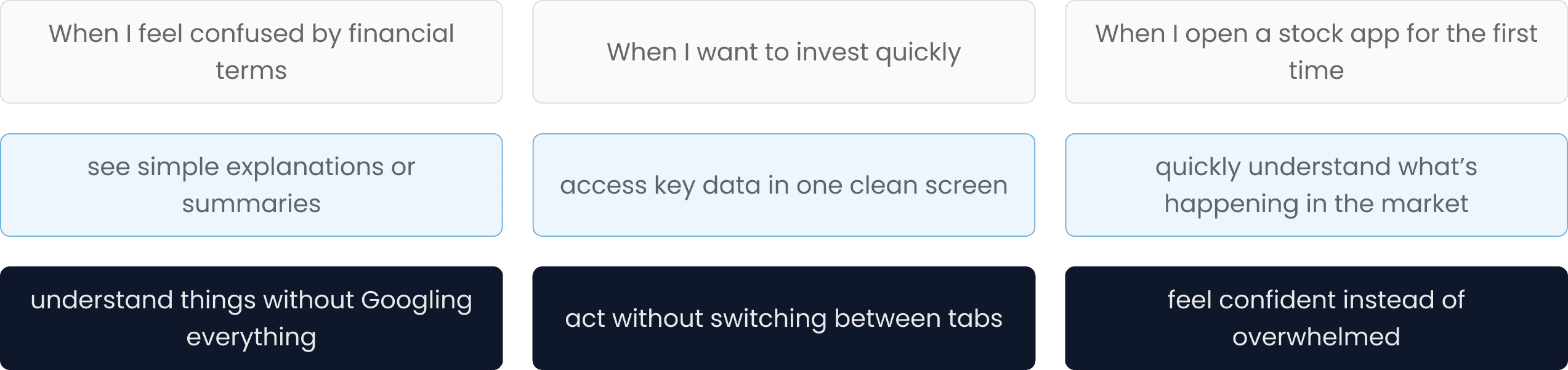
Using the Jobs-to-be-Done framework, I focused on the core tasks users wanted to accomplish, such as monitoring portfolios, placing trades, tracking market movements, and discovering investment opportunities. This helped ensure every feature supported a clear user goal.
Impact
Helped prioritize high-value user tasks, reducing unnecessary feature complexity.
Improved focus on the most frequently performed trading actions.
Kano Model
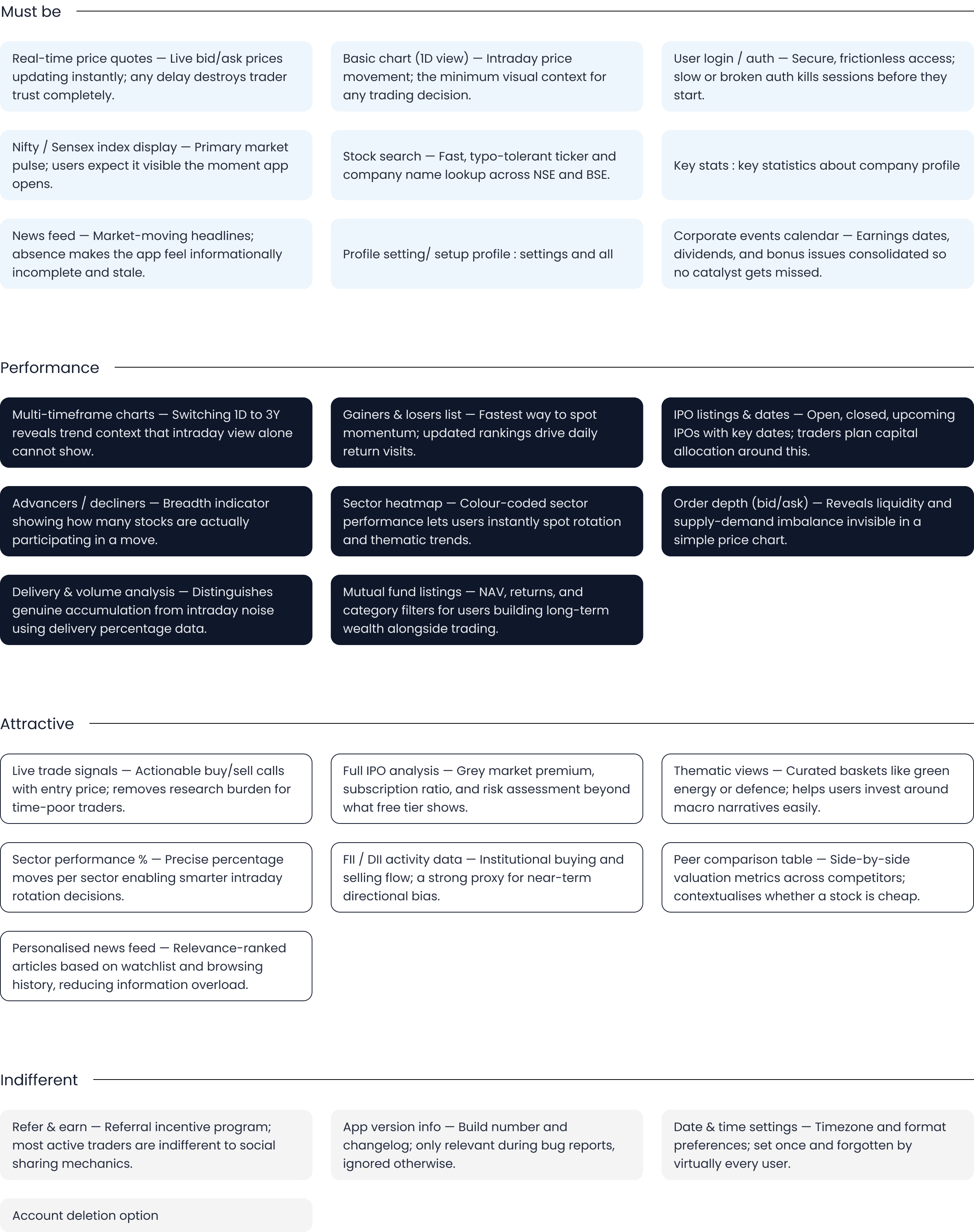
I categorized features using the Kano Model to distinguish between must-have, performance, and delight features. This helped balance business priorities with user expectations while planning the product roadmap.
Impact
Improved feature prioritization for development.
Focused resources on features with the highest user value.
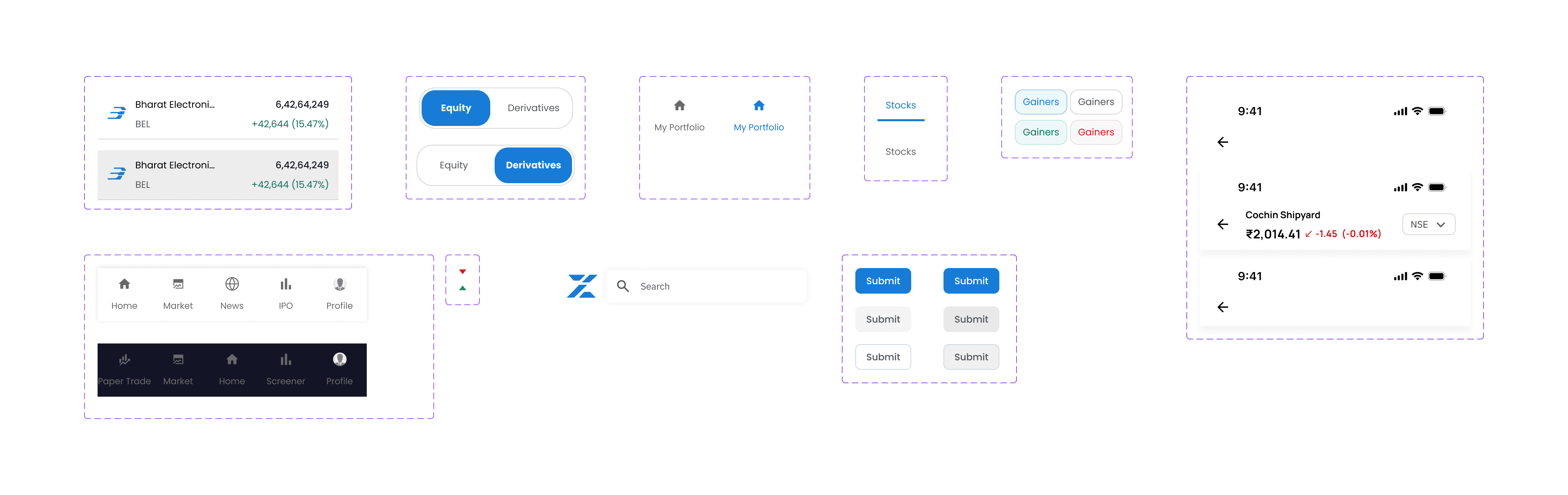
Components
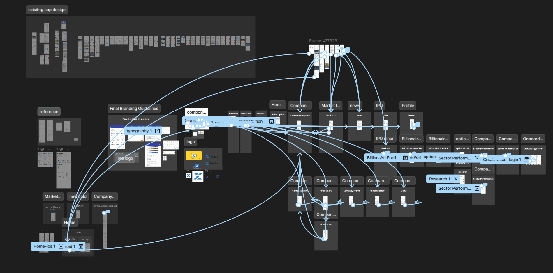
Prototyping & Testing
Once the core screens were designed, we moved into building an interactive prototype in Figma, connecting flows like Home, Market, News, IPO, Company Profile, Financials, Sector Performance, and Onboarding/Login into one clickable journey. This let us test the app end-to-end, the way a real user would move through it, rather than reviewing screens in isolation.
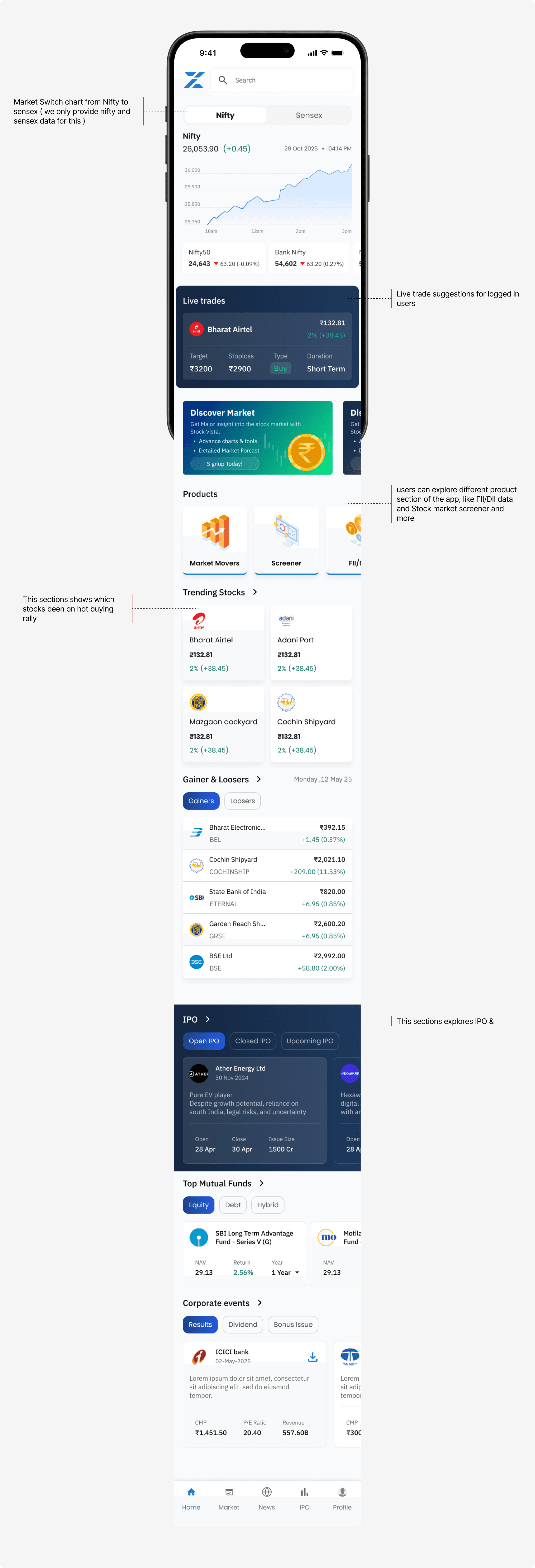
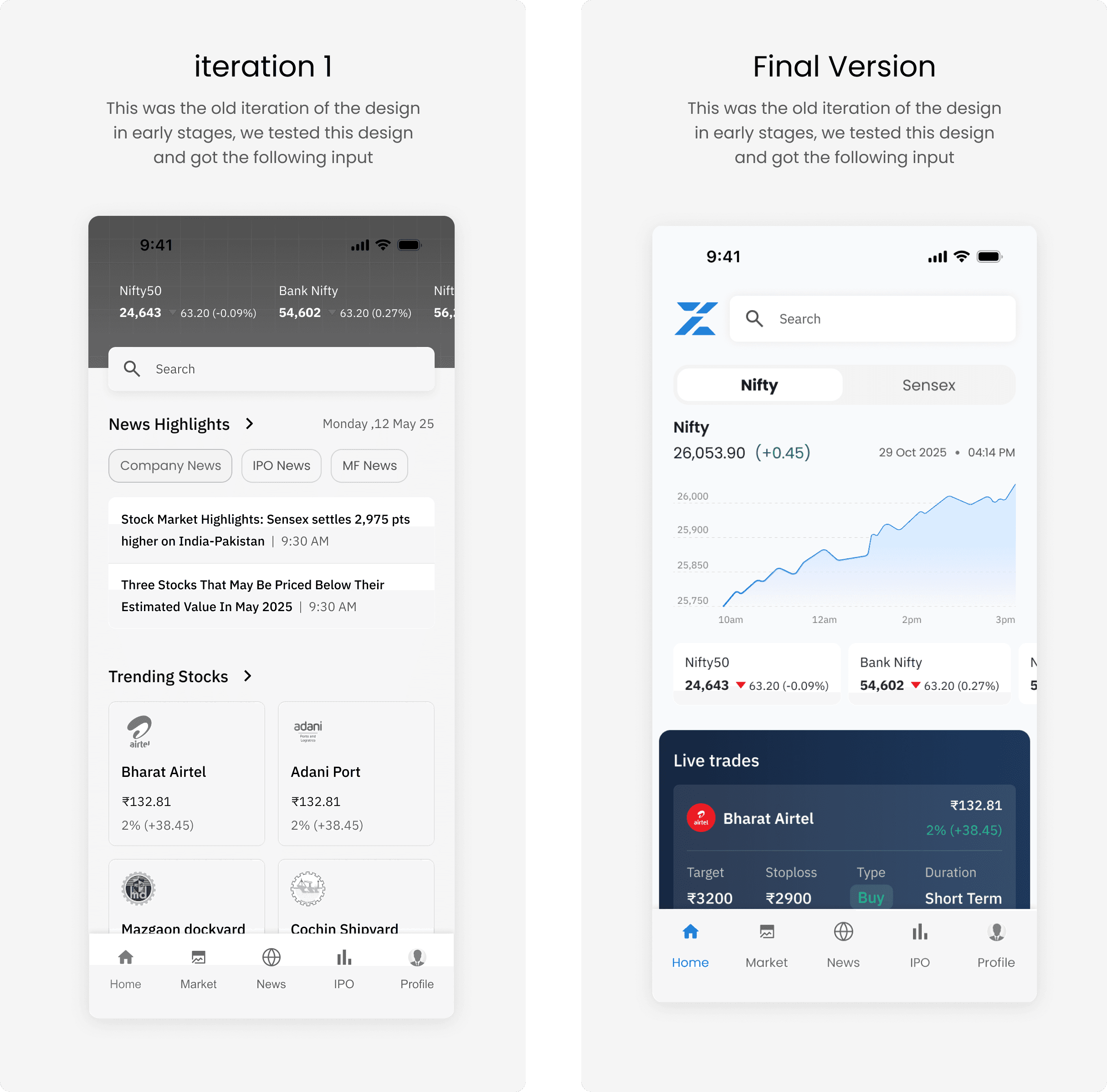
Home Page
I restructured the application's content and navigation into a logical hierarchy, making key sections such as Portfolio, Watchlist, Orders, and Market easier to find.
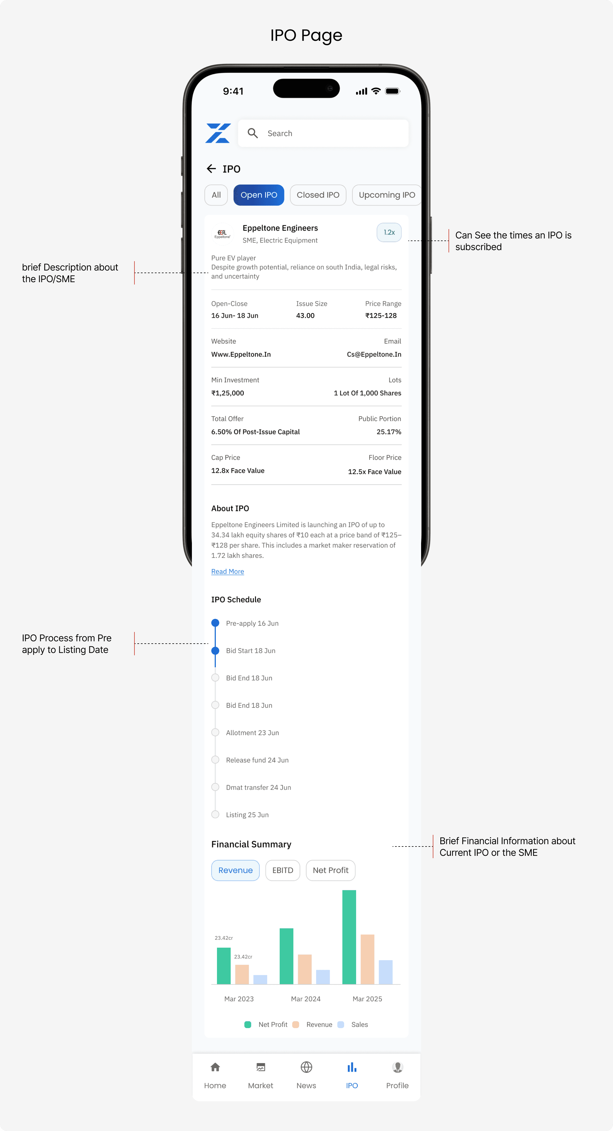
IPO Page
Displays upcoming, active, and listed IPOs with key details like price band, dates, and subscription status, helping users track and evaluate new listings before investing.
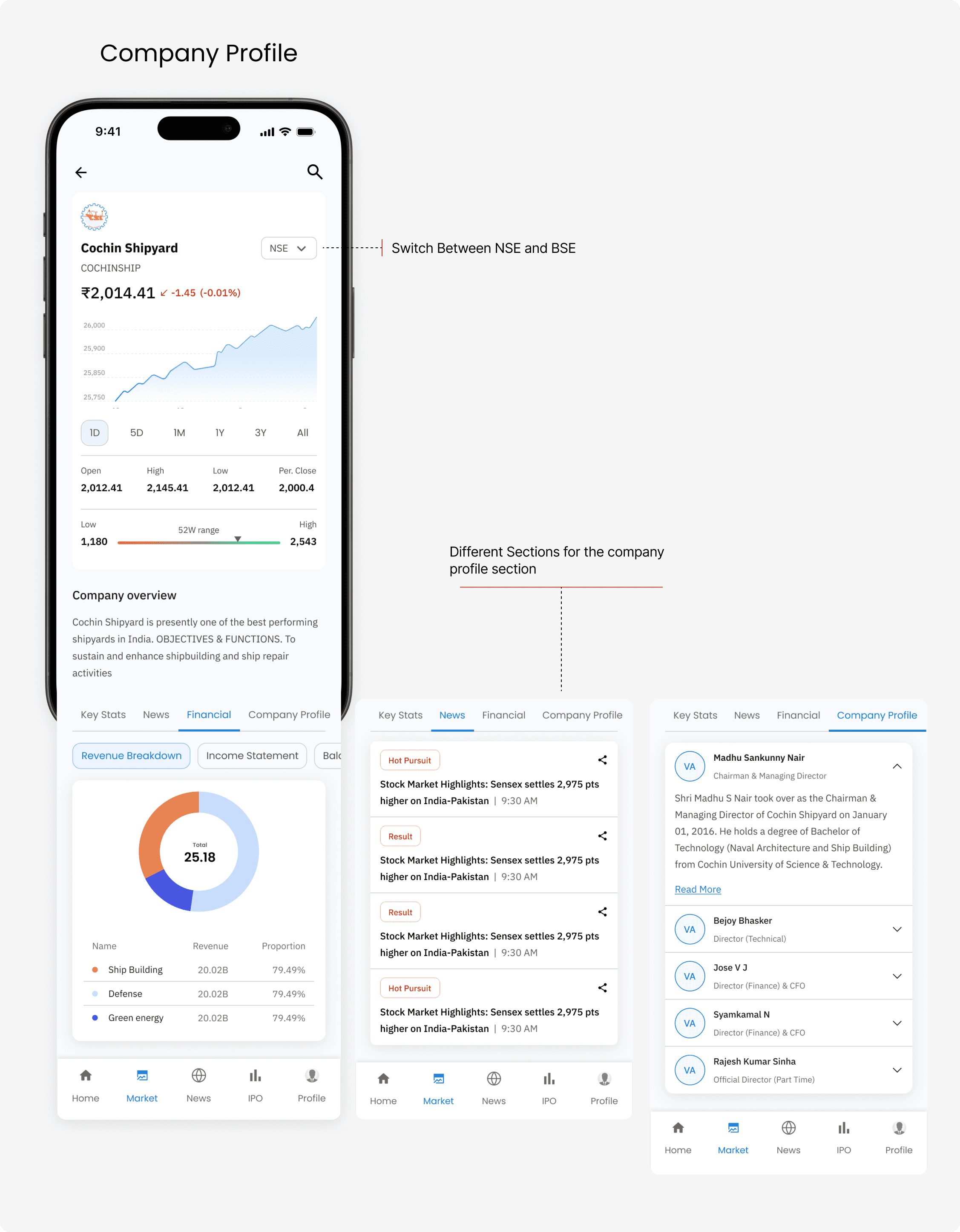
Company Profile
Shows company overview, financials, key metrics, and news in one view, giving users a quick snapshot before deeper research.
Next Steps / What Next
The app has launched, but usage analytics weren't instrumented at this stage, so we don't have measured numbers to report yet.
Key navigation issues (between Market, IPO, Portfolio, etc.) were caught and fixed during prototype testing, rather than surfacing as post-launch bugs
Recommended adding analytics (session time, drop-off points, onboarding completion) so future iterations can be measured against this baseline

