Subscription Management App
SubHub is a subscription management app which help users to track, monitor multiple subscription from different platforms all in one place securely
Timeline
Mar 2022
Role
UI/UX designer
Type
Personal

Goal
Helping users to remind, inform & show various subscription plans which they have and help them to make better decision to save time & money.
Challenges
To make an app which is efficient, and reliable subscription management app that allows users to monitor, track their subscriptions in one central location.
Design Process
I followed the Double Diamond Design thinking process for this project.

User Research
Conducted a Survey with 13 participants with following questions and gathered the necessary data.
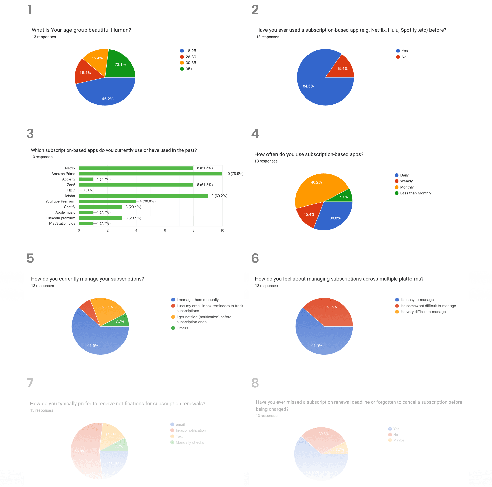
Research Insights :-
These are the key insights I gathered From the user surveys and painpoints:-
More than 75% of user uses Amazon Prime as primary subscription followed by Hotstar (69.2%) and Netflix (61.5%)
61.5% users forgot to renew their subscription plan and charged additionally
more than 60% users manage their subscription Manually & 53% of users prefers to get in-app notification about renewal subscription. (some companies prefer to automatically charge subscription fee without letting the user know)
Participants had problems managing and keeping track of multiple subscriptions
More than 69% of the user have Major concern is about Data privacy and security features followed by User friendliness. Users take serious note about their privacy.

Challenges
Did a secondary research and find out what are some major challenges are there in the existing market about subscription tracking app.
Integration challenges: Integrating with multiple platforms and services could be challenging, especially if the app needs to access private or proprietary APIs.
Security concerns: The app would need to be secure to protect users personal and financial information
User adoption: It may be challenging to convince users to switch to a new app for managing their subscriptionsSubscription limitations: Some subscription services may not allow third-party apps to manage renewals or cancellations
Trust : The app would need to build trust with users, especially if it is managing sensitive personal and financial information.
Pricing model: The app would need to have a clear pricing model that is transparent and fair to users.
How might We
How might we make User friendly app layout designs
How might we provide Transparency about security features (Visibility of system status Usability Heuristic)
How might we send Personalized notification system for users to remind them about renewing or about to expire subscription
How might we provide great user experience while canceling or renewing a subscription
Problem Statement
Many individuals subscribe to multiple services, such as streaming platforms, Shopping websites, gaming which can result in financial strain and confusion.
To create a user-friendly, efficient, and reliable subscription tracker app that allows users to monitor their subscriptions in one central location.
The app needs to be accessible and understandable for all user demographics, while providing accurate and real-time information on subscription details, reducing the likelihood of missed payments, unexpected charges with respect to transparency and security.
Card Shorting
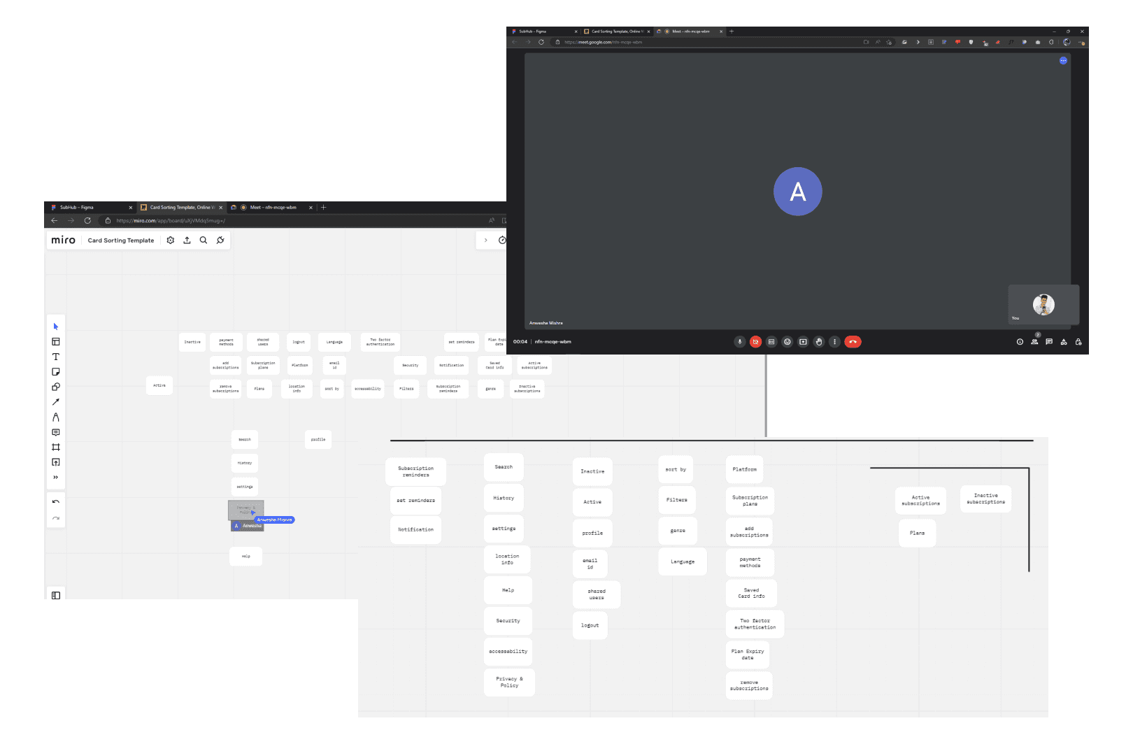
Did a card shorting excise with 5-6 participants in order to know the possible content requirements and information architecture and contents of the app.
Content used

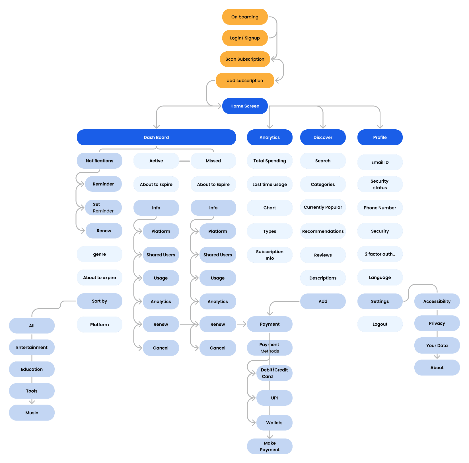
Information Architecture
Did a card shorting excise with 5-6 participants in order to know the possible content requirements and information architecture and contents of the app.
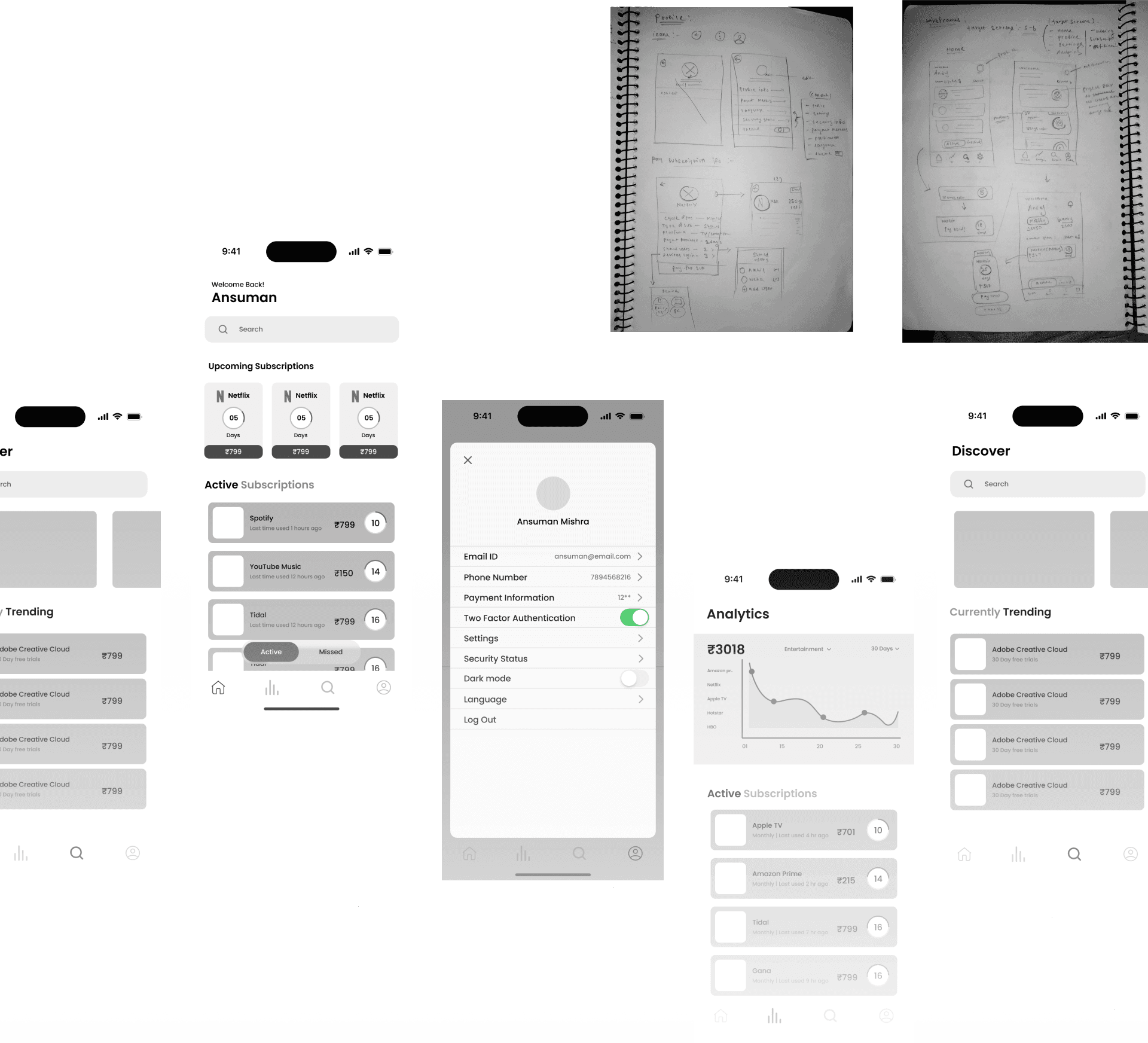
Wireframe & Sketches
Created some paper wireframes & digital Hifi wireframes
Usability Testing
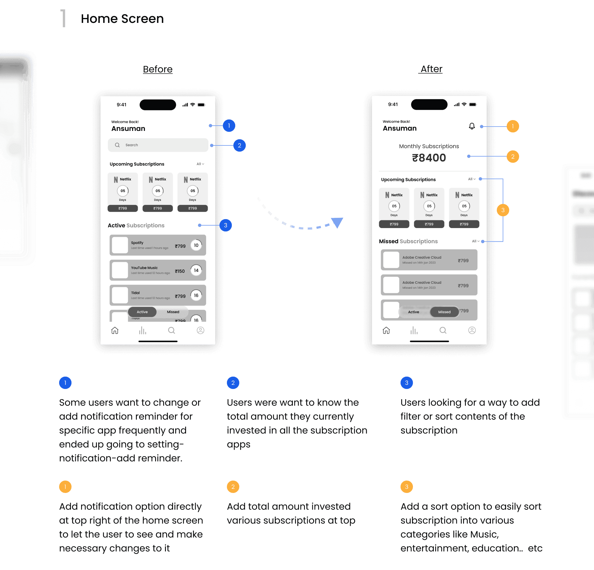
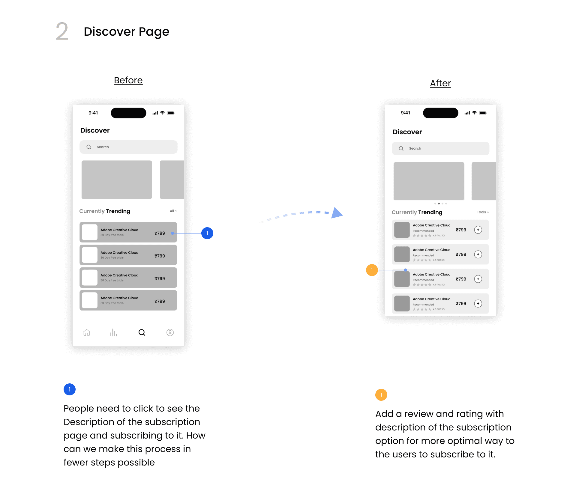
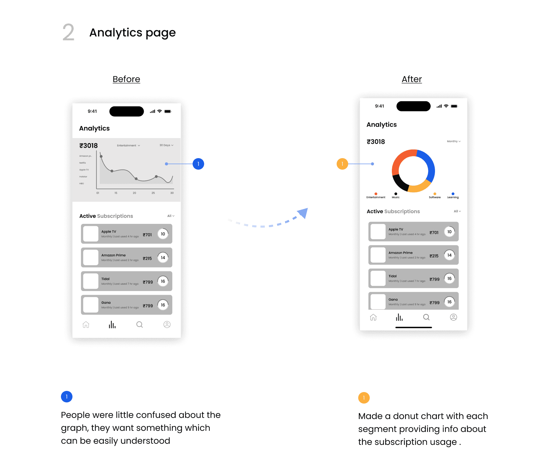
Conducted some usability testing of wire-frames before finalizing it
Style Guide
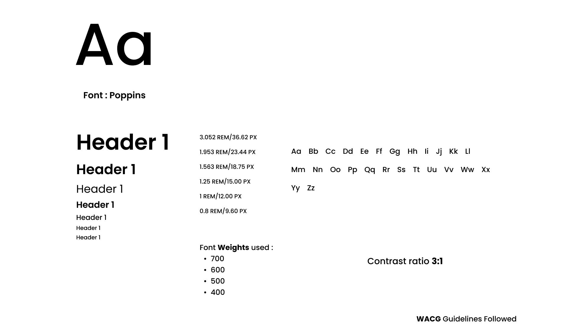
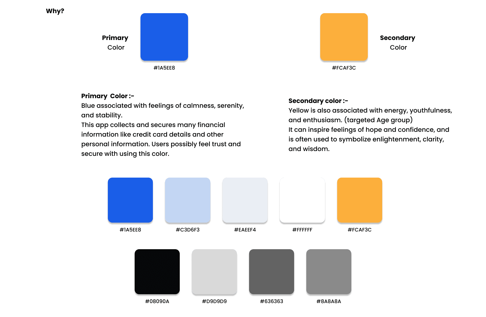
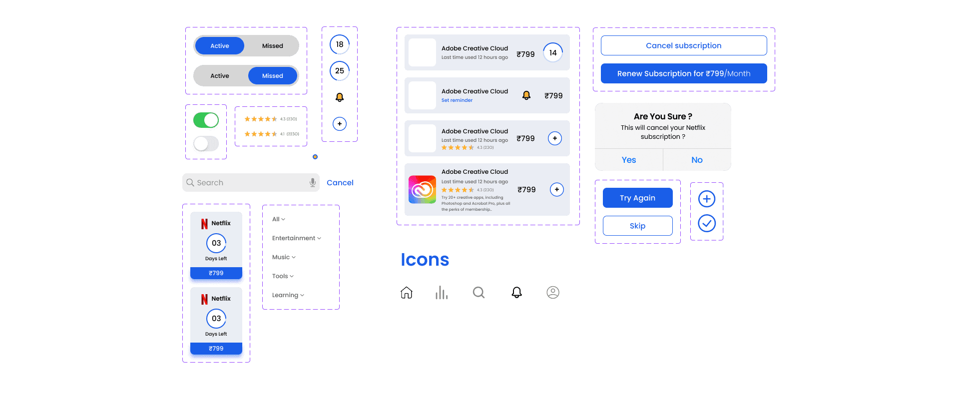
Style Guide allowed me to consistently design various parts of the application.
Typography
Colors
Components
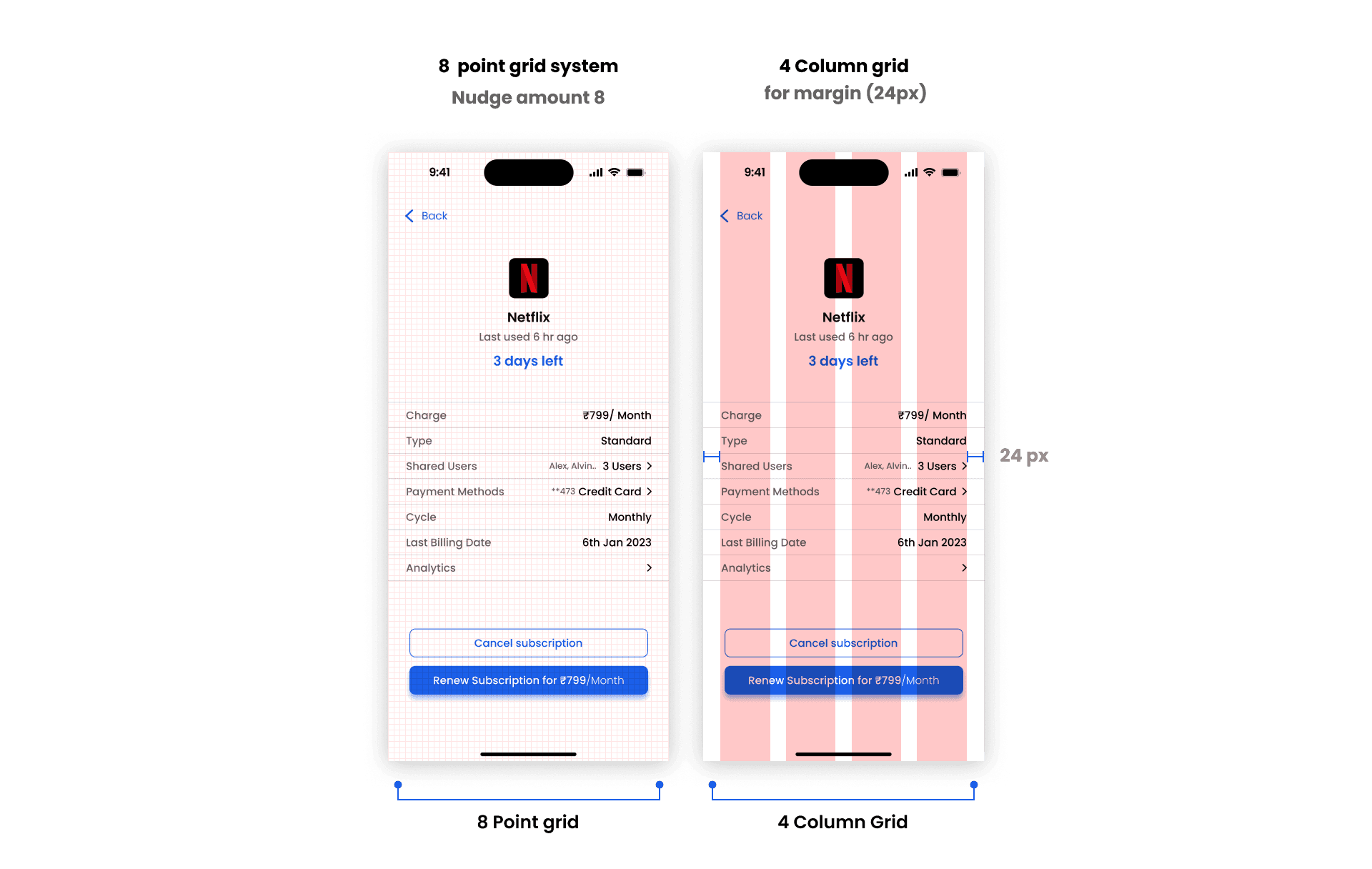
Grid System
High fidelity Designs
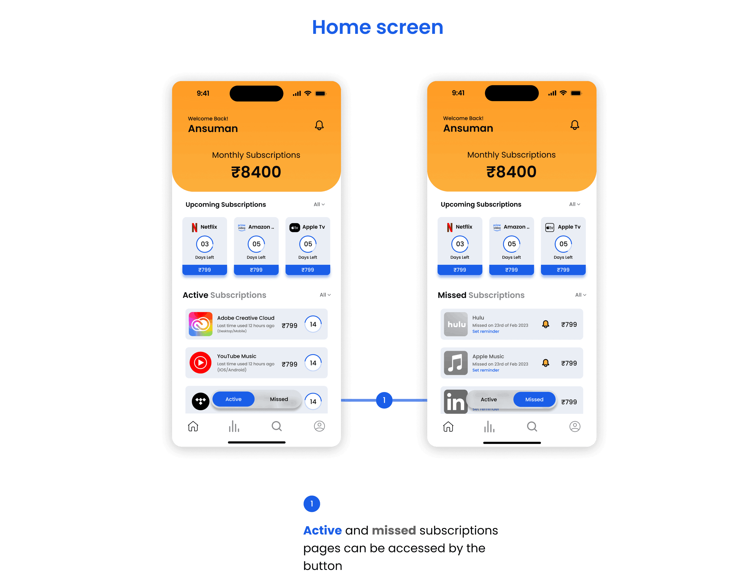
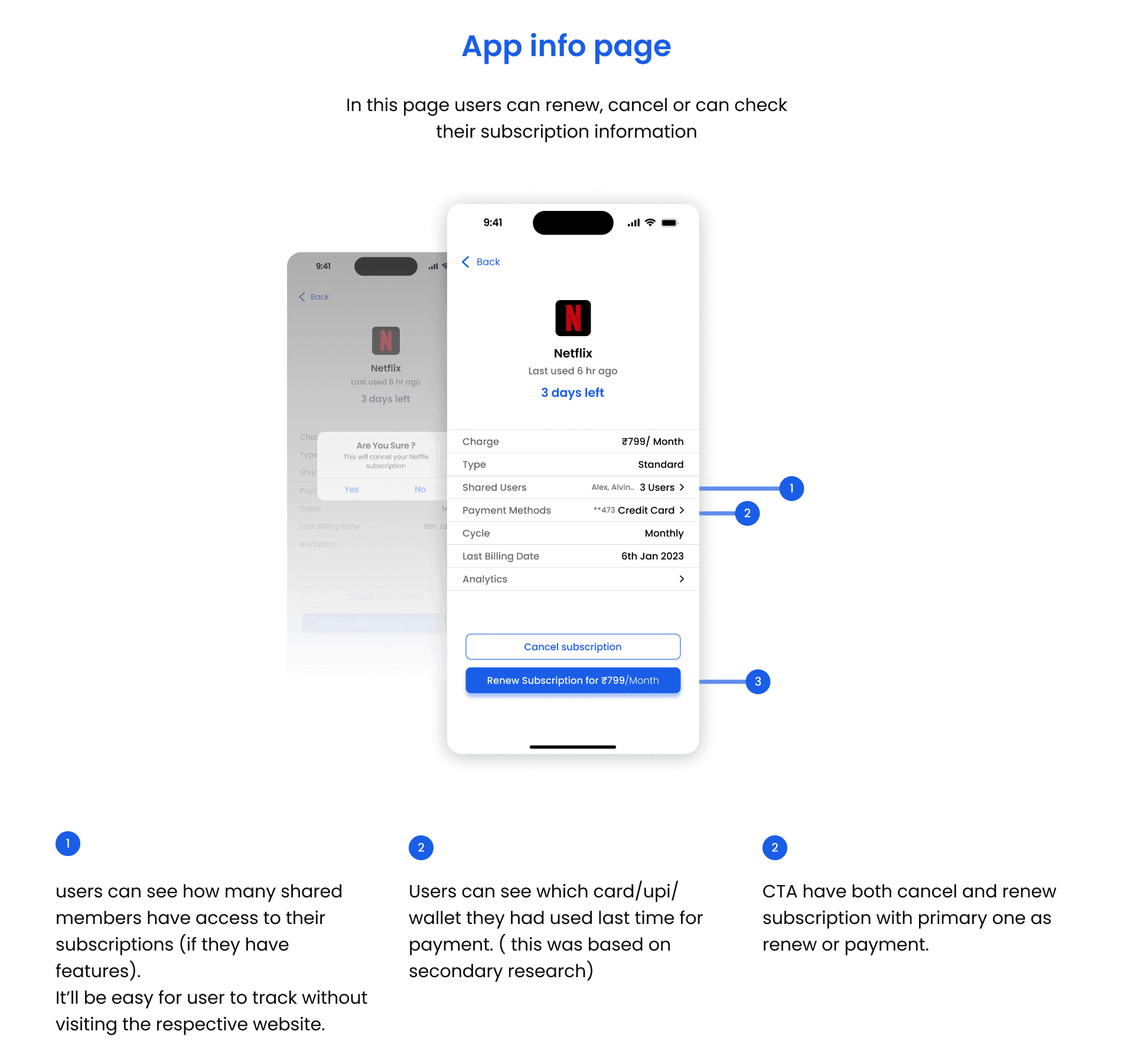
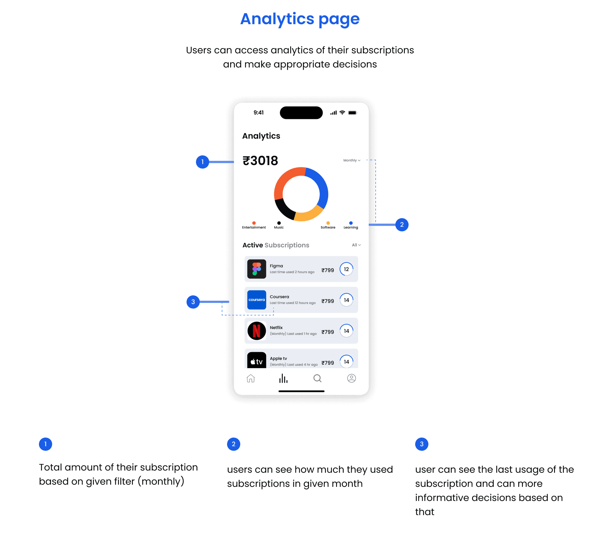
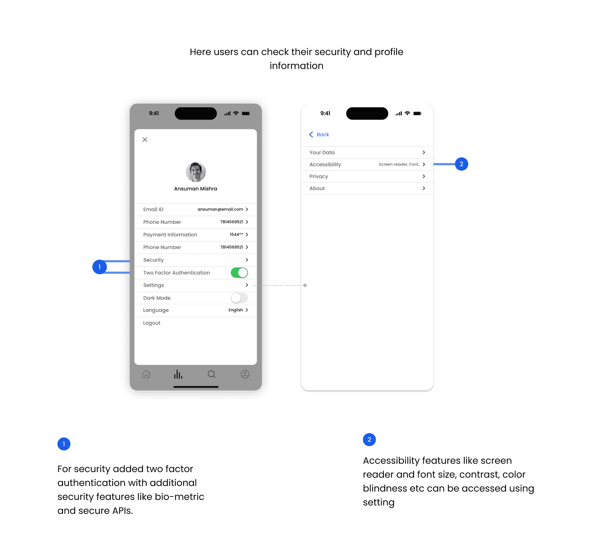
Here are some of the High fidelity Designs I made after doing Initial usability testing with wireframes

Usability testing
Conducted a second usability testing and users were very satisfied with the final design.
Prototyped and tested the final design with 5-6 participants with major flows.
Learning takeaways
The design is based on target user group. There could have more testing and more research. It is also important to note the feasibility of the design and features to keep in mind.
Design system helped me a lot to keep things organize and make consistency in all designs. One thing I learned the font line height with respect to the grid system.
Documentation is very important. It really helps you to organize your research and helps in consistency and scalability which I think is most important part. I’ll focus more on that in my next project work.

